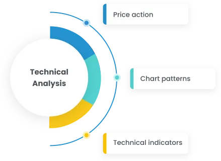
Technical Analysis

Introduction to Technical & Fundamental Analysis

Lesson 1: Introduction to Technical Analysis

There are two basic methods that traders use in determining when to enter the market when trading the stock, forex, and futures markets, which are:

Fundamental analysis which seeks to determine the value of a financial instrument by analyzing all the things such as the balance sheet of a company when trading stocks, or interest rate expectations when trading currencies to try and estimate whether a particular financial instrument is over or under valued.

Technical analysis on the other hand focuses purely on historical price action of a particular instrument to determine whether the instrument is more likely to increase or decrease in value in the future, and therefore how it should be traded.

Although there are exceptions to this, as a general rule, longer term investors tend to base their trading decisions on fundamentals and shorter term traders tend to focus more on technicals. From my experience, although active traders tend to focus more on technicals than fundamentals, they still have an understanding of fundamentals and many consider fundamental factors in their trading decisions along with their technically based analysis. There is much debate as to which method is better as there are successful investors and traders who focus only on fundamentals (a great example being warren buffet) just as there are those who are successful and focus only on technicals (a great example being Richard Dennis).

As the Informedtrades.com reader base tends to focus more on technicals than fundamentals this is where the focus of the initial lessons will be as well. Once we have built a solid understanding of technical analysis and the tools used by a technically based trader, we will begin exploring the fundamental factors which move the markets. At that point you can decide for yourself whether you would like to base you trading on technical analysis, fundamental analysis, or a combination of the two. So there you have a brief overview of the two ways that traders analyze the market. In the next lesson on Dow Theory we will take a look at the history of technical analysis and the way a technical trader looks at price patterns to get a big picture overview of where the market has been, and where it might be headed next.

Lesson 2: Introduction to Dow Theory

In the last lesson on technical analysis we talked a bit about the different ways that traders analyze the markets. In this lesson we will look at the history of technical analysis and something known as Dow Theory.

Most consider the father of technical analysis to be Charles Dow, the founder of Dow Jones and Company which publishes the Wall Street Journal. Around 1900 he wrote a series of papers which looked at the way prices of the Dow Jones Industrial Average and the Dow Jones Transportation Index moved. After analyzing the Indexes he outlined his belief that markets tend to move in similar ways over time. These papers, which were expanded on by other traders in the years that followed, became known as “Dow Theory”.

Although Dow Theory was written over 100 years ago most of its points are still relevant today. Dow focused on stock indexes in his writings but the basic principles are relevant to any market.

Dow Theory is broken down into 6 basic tenets. In this lesson we are going to take a look at the first 3 and then finish up our conversation of Dow Theory in the next lesson by looking at the last three.

The first tenet of Dow Theory is that The Markets Have 3 Trends.

• Up Trends which are defined as a time when successive rallies in a security price close at levels higher than those achieved in previous rallies and when lows occur at levels higher than previous lows.
• Down Trends which are defined as when the market makes successive lower lows and lower highs.
• Corrections which are defined as a move after the market makes a move sharply in one direction where the market recedes in the opposite direction before continuing in its original direction.

The second tenet of Dow Theory is that Trends Have 3 Phases:

• The accumulation phase which is when the “expert” traders are actively taking positions which are against the majority of people in the market. Price does not change much during this phase as the “experts” are in the minority so they are not a large enough group to move the market.
• The public participation phase which is when the public at large catches on to what the “experts” know and begin to trade in the same direction. Rapid price change can occur during this phase as everyone piles onto one side of a trade.
• The Excess Phase where rampant speculation occurs and the “smart money” starts to exit their positions.

Here you can start to see how the psychology of investors and traders comes into play an important concept which we will delver deeper into in later lessons.

One of the best examples which shows these three phases occurring in an uptrend that most people are familiar with is the run-up up the NASDAQ into 2000:

Chart of the NASDAQ Showing the 3 Phases of a Trend:

The third tenet of Dow Theory is that The Markets Discount All News, meaning that once news is released it is quickly reflected in the price of an asset. On this point Dow Theory is in line with the efficient market hypothesis which states that:

“the efficient market hypothesis (EMH) asserts that financial markets are “informationally efficient”, or that prices on traded assets, e.g., stocks, bonds, or property, already reflect all known information and therefore are unbiased in the sense that they reflect the collective beliefs of all investors about future prospects.”

Source: Wikipedia

This concept that the markets discount all news is one that is sited in arguments in favor of using technical analysis as a tool to profit from the markets as if it is true that markets already discount all fundamental factors then the only way to beat the market would be through technical analysis.

So now you should have a good understanding of the first three tenets of Dow Theory including the different types of trends, the different phases of trends, and Dow’s concept that the price of an asset already reflects all known news. In our next lesson on Dow theory we are going to look at the second three tenents.

Lesson 3: Dow Theory Part II

In yesterday’s lesson we gave an introduction of Dow Theory and looked at the first three tenets which are: markets have three trends, trends have three phases, and the markets discount all news. In today’s lesson we are going to take a look at the second 3 tenets which will finish up our discussion of Dow Theory and give us a strong basis which we can then use to analyze trends and eventually place some trades.

Tenet four of Dow Theory is that The Averages Must Confirm Each Other. The averages must confirm each other. Here Dow was referring to the Dow Jones Transportation Index and the Dow Jones Industrial Average. To understand this point it is important to remember that in Dow’s time the growth in the US was coming mainly from the Industrial sector. These two indexes were made up of manufacturing companies and the rail companies which were the primary method used to ship the manufacturers goods to market.

What Dow was basically saying here is that you could not have a true rally in one of the averages without a confirmation from the other because if manufacturer’s profits were rising they would have to ship more goods. This meant that the profits of the transportation companies and therefore the transportation average should rise too. Dow stated that when these two averages moved in opposite directions it was a sign that the market was going to change direction.

Tenet five is Trends Are Confirmed by Volume. What Dow was saying here was that there are many reasons why price may move on low volume, but when prices move on high volume there is a greater chance that the move is representative of the overall market’s view. Dow believed that if many traders were participating in a particular price move and the price moves significantly in one direction, then this was an indication of a trend developing as this was the direction the market was anticipated to continue to move.

Tenet six is that Trends Exist Until Definitive Signals Prove That They Have Ended. What Dow was saying here is that there will be market moves which are against the primary trend but this does not mean that the trend is over and the market will normally resume its prior trend. There is much debate on how to best determine when a definitive signal has been given that the trend is over and this is where our study of technical analysis in future lessons will take us.

Now that you have read this article you should have a basic understanding of the background of how prices move and what market technicians look for as the foundation of their analysis. Next we are going to look at the basics of charts and the different types of charts that traders use to analyze the market.

Lesson 4: Forex, Futures and Stock Price Charts

In our last lesson we wrapped up our discussion on Dow Theory. Today we are going to talk about the basics of charts.

The tool of the technician when analyzing the forex, futures, or stock markets is the price chart. Very simply a price chart is a chart showing the movement of the price of a financial instrument over a chosen time. As you can see on the chart below of GOOGLE the bottom or x axis shows the time period which was chosen to display (in this case daily), and the vertical or y axis shows the price of the instrument (in this case the stock price of GOOGLE)

Chart of GOOGLE

Most charts will allow a wide variety of time frames to be displayed and the time frame that technicians choose to use varies widely and depends on each traders trading style. In general, longer term traders will focus on daily time frames and above, and shorter term traders will focus on intraday charts such as hourly or 15 minute charts. Many traders will also use a combination of time frames in order to get a full picture of what price has been doing by, for instance, looking first at a longer term daily chart, then moving to an hourly chart, and then finally to a 15 minute chart.

Types of Charts

Although there are many different types of charts which stock, traders of the stock, futures and forex markets use, the most common, which we will review below, are the line chart, the bar chart, and the candle stick chart.

Line Charts

A line chart is the most basic type of chart as it displays the least amount of data. Very simply, line charts display only the closing price of an instrument and are used by traders who do not care about viewing the open, high, and low prices or when only the close price is available.

Bar Charts

In addition to the close price, bar charts also show the open, high, and low prices for the time period selected. The name of the chart comes from the fact that the high and low of the instrument for the time period selected is displayed as a two points connected by a vertical line or bar. The open and close are then displayed as short horizontal lines placed across the vertical lines.

As you can see from the chart below bar charts display a much more detailed picture of the price movement of a particular security than do line charts.

Candlestick Charts

Candlestick charts (which are also sometimes referred to as Japanese candlesticks because they originated in Japan) display the most detail for the price movement of a security of the three chart types listed here. A candlestick chart is similar to a bar chart with one significant difference – in addition to displaying the open, high, low and close prices, candlestick charts use different colors to represent when the open is higher than the close and vice versa.

In general when the open price for the time period selected is lower than the close, white or unshaded candle form and when the open is higher than the close a black or shaded candle forms. I say in general here in reference to the colors of the candles as sometimes instead of shaded and un shaded different colors such as red for down days and green for up days are used.

On a candlestick chart the thick or colored part of the data points is referred to as the body of the candle and the thin lines at the top and bottom (which represent the space between the open/close and the high/low for the time period selected are referred to as the wick.

You should now have a good understanding of price charts and the main types of charts available to you as a trader. In future lessons we will go into more detail of how to utilize a chart to analyze and place trades. In our next lesson we are going to go over the basics of support and resistance and how we can use these levels to spot potential trading opportunities.

Lesson 5: Support and Resistance

In our last lesson we looked at the basics of stock, futures, and forex charts. In this lesson we are going to look at something which is known as support and resistance and what these levels tell us about potential future market moves.

As many of you already know, just as anything where market forces are at play, the price of a financial instrument in the stock, futures or forex markets is ultimately determined by supply and demand. Very simply, if demand is increasing in relation to supply then price will rise, and if demand is decreasing in relation to supply then price will fall.

As we have learned in previous lessons, what you are basically looking at when you see an uptrend on a chart is an extended period of time where demand has continued to increase in relation to supply. Similarly when looking at a downtrend you are seeing an extended period of time where demand has decreased in relation to supply for an extended period of time, causing price to fall. Similarly, in a downtrend, demand is continuously falling in relation to supply which causes the price to fall.

In this lesson we are going to look at something known as support and resistance which are price levels where the supply demand equation is expected to change, and price is then expected to stop moving in the direction it was moving previously, or reverse direction.

Support

Support is the price level of a particular instrument in the stock, futures, or forex market where there are enough demand should price reach that level to keep the price from declining further.

Resistance

The opposite from support is resistance which is the price level of a particular instrument where there is not enough demand should price reach that level for prices to continue to rise.

Chart Showing Support and Resistance in a Range Market

There are many ways to try and determine support and resistance however the most basic way is looking for areas on the chart where the price has touched multiple times (as in the above examples) without breaking through that level. The more times that price has touched a support or resistance without breaking through it the more “valid” that level is thought to be.

A very basic strategy that some traders use is to look for areas of support and resistance and sell as price approaches resistance anticipating a decrease in price and to buy as price approaches support anticipating an increase in price. Support and resistance levels can also be used as take profit targets a concept which we will explore in later lessons.

This is easiest to see in markets which are trading sideways as in the chart above. You can however also spot support and resistance in trends as the trend line and potential trend channel which are drawn to analyze the trend are acting as support and resistance in exactly the same way as they do above.

Chart Showing Support and Resistance in a Trending Market

You should now have a good understanding of the basics of support and resistance. In the next lesson we will look at something called multi time frame analysis and how you can use this to determine which levels may be good areas to look for potential trading opportunities and which are not.

Lesson 6: Multiple Time Frame Analysis for Forex, Futures, and Stock Traders

In our last lesson we learned about support and resistance and how to spot these levels in the market. We should now have a good understanding of how to spot trends in the market, some of the components that make up those trends, and finally how to recognize support and resistance levels. Now lets tie everything together we have learned thus far with the final concept of this series, Multi Time frame analysis.

No matter what time frame you end up using when trading the stock, futures or forex market or what time frame a particular trading strategy calls for, it is important always to have a big picture overview of what is happening in the market. Although there are exceptions, in general most traders will tell you that if your trade setup or analysis lines up on multiple time frames, then the odds of being correct are greatly increased.

Lets look at a simple example by looking for a trade to place to take advantage of a trend that we have spotted on a chart. For this example lets say we are looking at a 5 minute chart of the EUR/USD.

5 Minute EUR/USD Chart:

As you can see from the above chart if we were just looking at the EUR/USD 5 minute chart then we would note the downtrend in the market and sticking to the simple strategy of simply following the trend, we would look for opportunities to sell into the downtrend.

As we want to have a better feeling for the general direction of the market however when we place this trade we next take a look at an hourly chart.

1 Hour EUR/USD Chart:

As we can see from this chart we also spot a longer term downtrend on the hourly chart thus giving us more confidence in our potential trade into the downtrend on the 5 minute chart.

Lastly to make sure that we are getting the full picture we pull up a daily chart.

Daily EUR/USD Chart:

When looking at this chart however we see that not only is the EUR/USD in an uptrend on the daily chart, it is in an extended uptrend. As the daily chart does not line up with the 5 minute and the hourly chart we may want to question whether or not to place the suggested downtrend trade in the face of the large uptrend on the longer term chart.

Now that we understand how a trading signal in the stock, futures, or forex market can be considered “stronger” if it lines up on multiple time frames, a more prudent way to search for potential trades may be to start by looking at the longer term time frames, and then look for opportunities on shorter term charts which are in line with what the longer term charts are showing.

The same concept applies when looking at support and resistance. In general the more time frames and the longer the time frame is that a support or resistance level shows up on the more “valid” that level is considered.

That’s our lesson for today. You should now have a good understanding of multiple time frame analysis and how looking at different time frames can give us more or less confidence in trades we are considering making.

In our next lesson we are going to start a new series with an introduction to forex, futures, and stock market chart patterns and the double top and double bottom pattern.

Contact us

Need support?
Get in touch now

The Forex Signals Team is available 24/7. Please fill in the form or contact us via Live Chat

Get Support:
What happens next?
1

We’ll schedule an online chat

2

Find the solution to your query

3

Execute to the best of our ability!

Please fill in this form below!